
This is as far as I have got with mixing more than two colours in basic 9P blocks … and the results can be stunning if you like the colours!

The half blocks around the edge of the second design are interesting!
read more
This is as far as I have got with mixing more than two colours in basic 9P blocks … and the results can be stunning if you like the colours!

The half blocks around the edge of the second design are interesting!
read more
I love it!
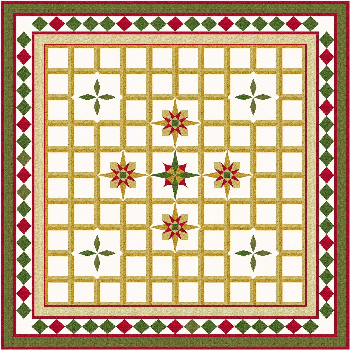
Love the way the stars near the corners are framed … a nice contrast to the other blocks.
Christmas is approaching … a group of quilters yesterday spent more time discussing Christmas shopping than fabric shopping!
read more
Love it!

It would be interesting to see some of my virtual quilt designs as part of the tiled floor of a very large hallway, or perhaps made up as a floor mat … or carpet tiles.
read more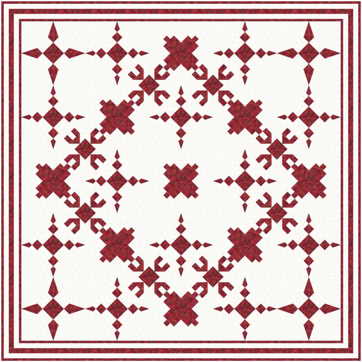
While converting a design with a white background to one with a red background I noticed some of the versions and decided to save each one, then worked out that if I added the new background blocks in a different order I got different designs, and some of them were rather impressive.
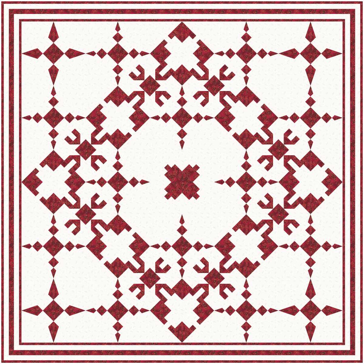
I picked out one block to change, but missed one of them, but saved the design anyway.
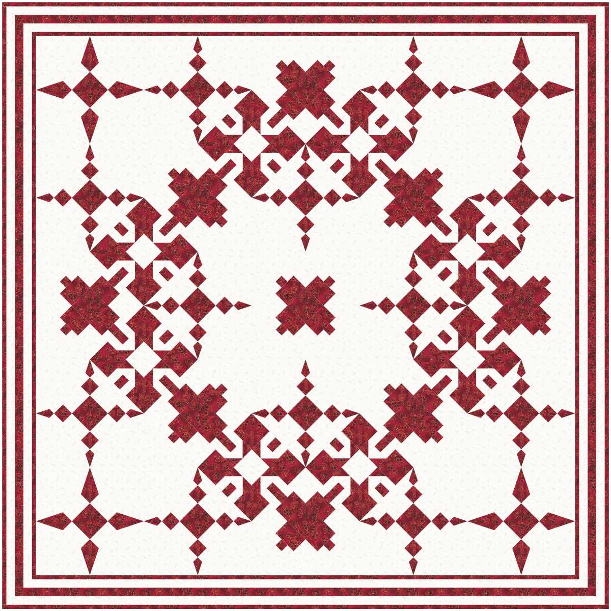
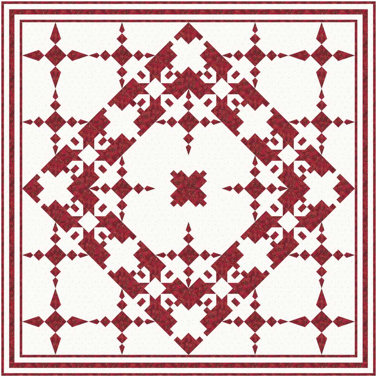
One on the left is interesting, and I like the one on the right.
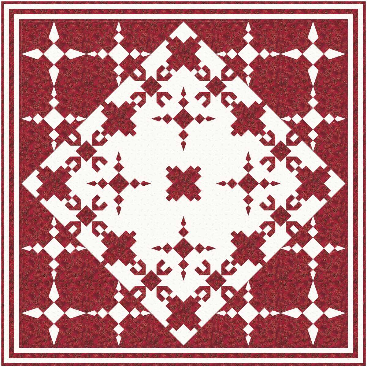
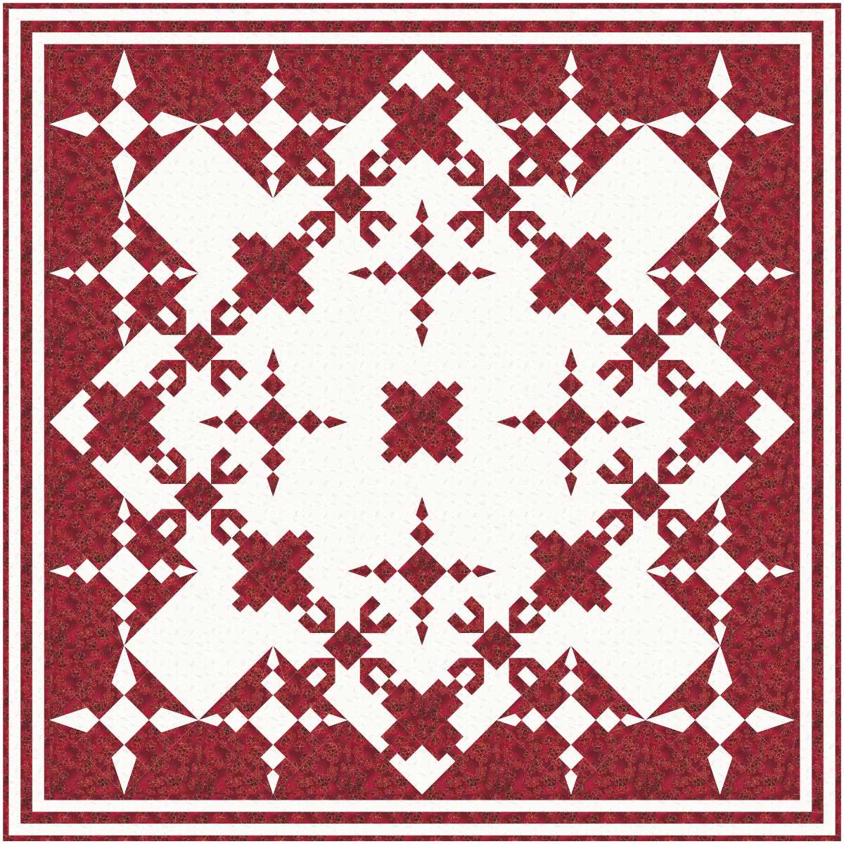
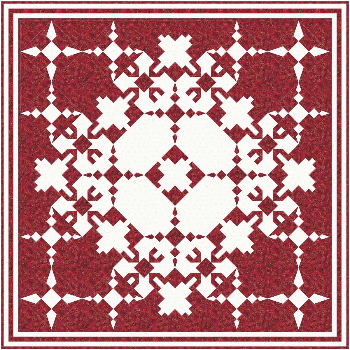
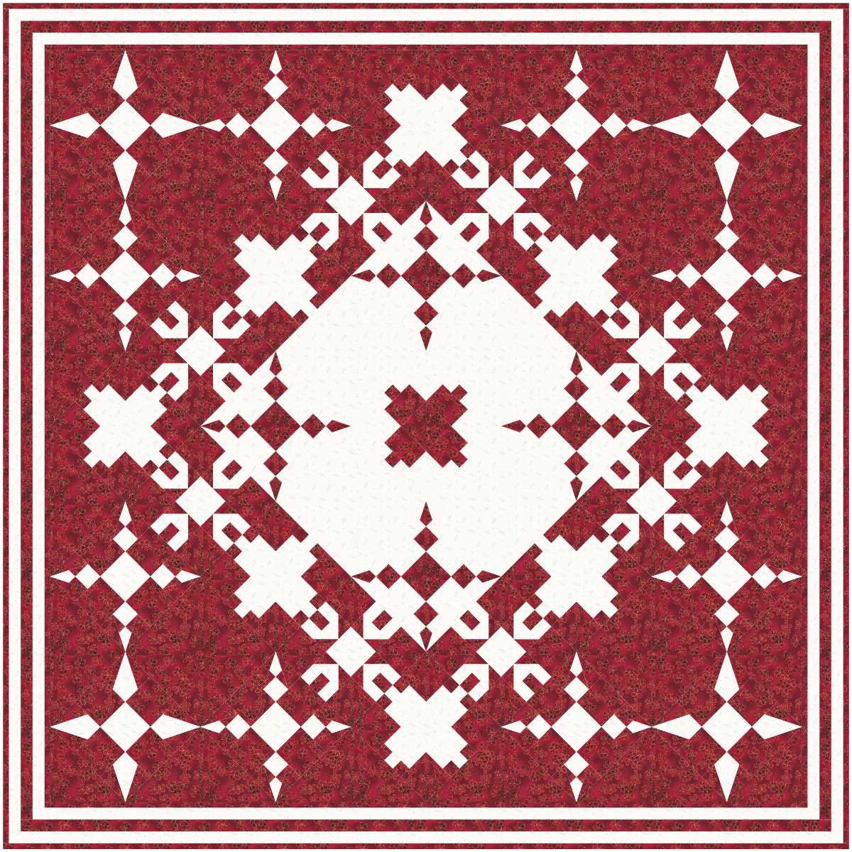
The four above are getting more dark background added with some very interesting results!
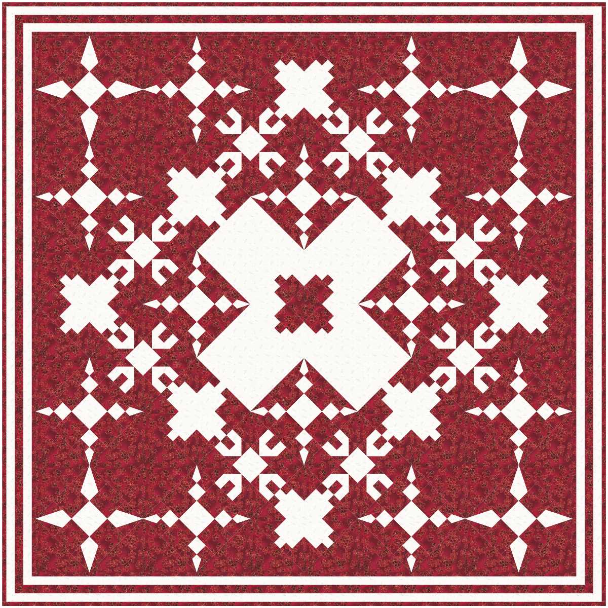
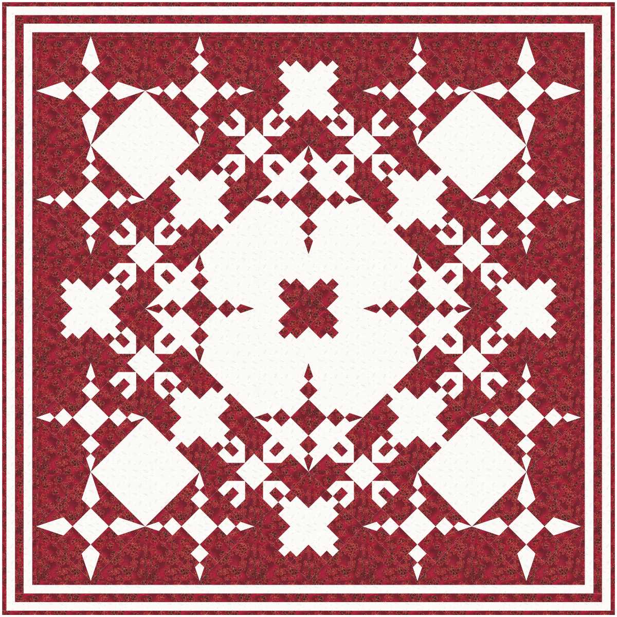
Getting more interesting ...
read more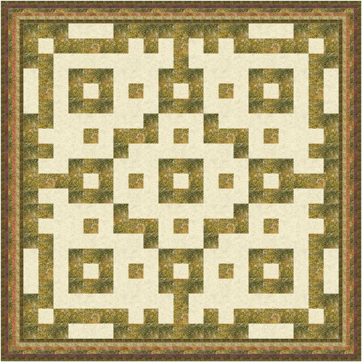
These designs use just one very basic block, the basic Nine Patch, which is simply nine squares stitched together to make a square block. The designs could be made with just two fabrics, or one rather plain light background fabric with contrasting dark scraps.
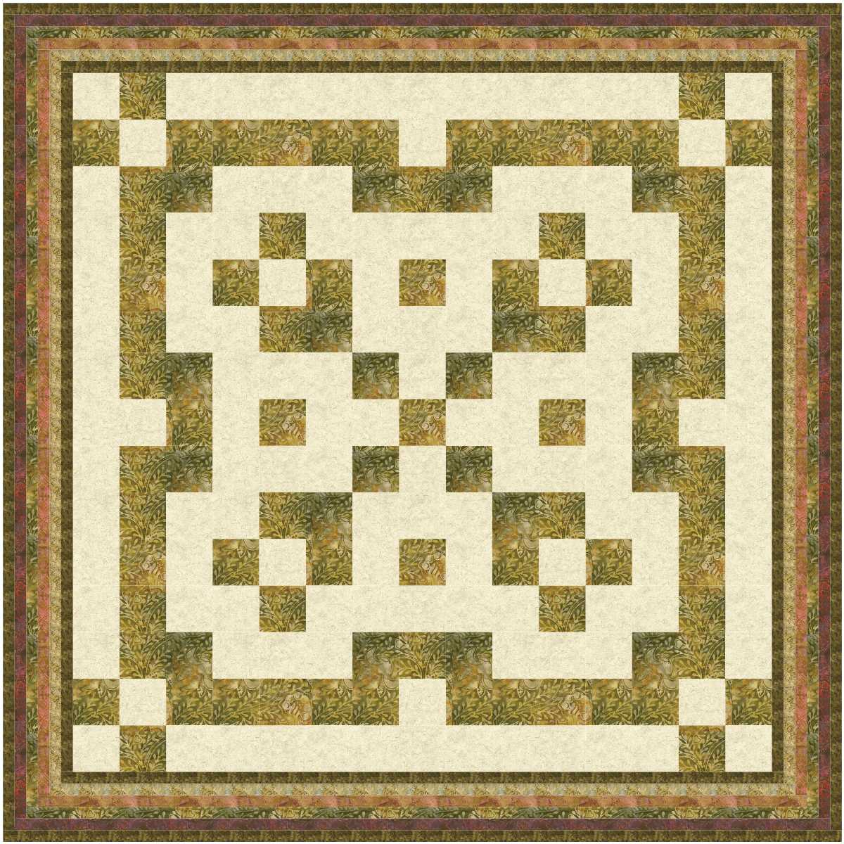
I love the border of these designs too … simply 5 narrow strips of five different fabrics which includes the dark fabric used in the blocks, with the darkest of the fabrics used as the binding.
read more
Starry night, even though there are just five star blocks!
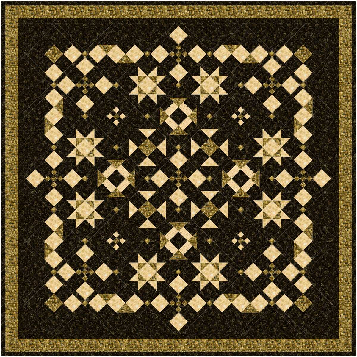
I should start a new project file with the same fabric choices as this one, but with all star blocks.
read more
Interesting, but the corners of the blocks overpower the rest of the block … perhaps a colour change to make it much paler would make the balance better..

Also interesting. Colour balance is better but not perfect.
read more